30 Modern Small Business Websites Examples for 2025
WebBuildersGuide.com earns commission from some of the web builders and hosting providers listed on this website. Learn moreYou must have thought of designing your own business website at some point in life. But why is it necessary to have a company website? A solid online presence has been an active push for consumers or your target audience. A corporate website can truly make or break any business. An online storefront can make a huge opportunity for many entrepreneurs to grow their businesses. For all of these reasons, it is essential that every small business have a business site.
You can find many examples of small business websites that are jaw-droppingly amazing. A good business website shows that your brand is credible, professional, and worthy of people’s customs.
Good Examples of Business Websites
For your ease, we have listed down 30 examples of small business websites.
BrandVillage
Made with WordPress
Check this business website
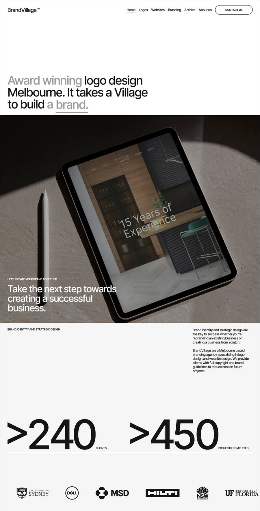
BrandVillage is an award-winning branding agency. BrandVillage believes every business’s success depends on its community reputation, brand identity, strategy, and guidelines. It offers various graphic design services, including logo design, website design, packaging design, and more.
Its website design gives an impression of a responsive and user-friendly. Moreover, you find a consistent theme of great photography on bold backgrounds to give extra interest.
Venkataramanan Associates
Made with WIX
Check this business website
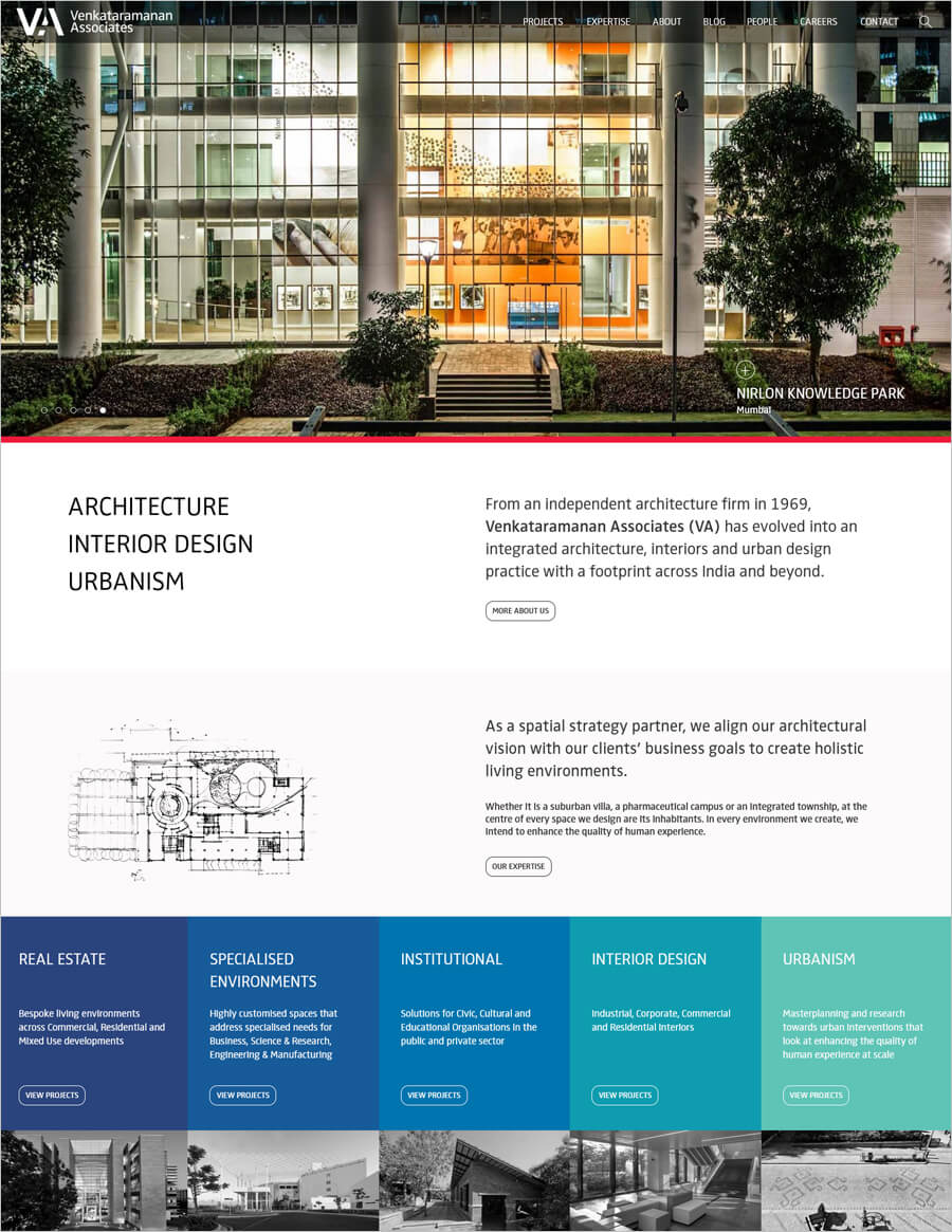
Venkataramanan Associates is an award-winning architecture firm operating out of Bangalore. VA promotes a positive approach to collaboration of engineering, technology, and design innovation to influence its design capability.
VA website features a quality design that uses sliding photos of their projects on the Homepage. The site is easy to navigate with an excellent user experience and allows potential clients to get in touch with the business.
WeTalkMoney
Made with Weebly

Check this business website
WeTalkMoney is your financial planner, financial advisor, and personal guide to walk into life after retirement. Get your investing strategies, personal finance tips, and ways to build wealth with WeTalkMoney.
The website shows standout photography at the beginning and center of its Homepage. A horizontally sliding deck of testimonials and white typography gives a sleek, professional layout that will stop visitors in their tracks.
Keen Home
Made with Shopify
Check this business website
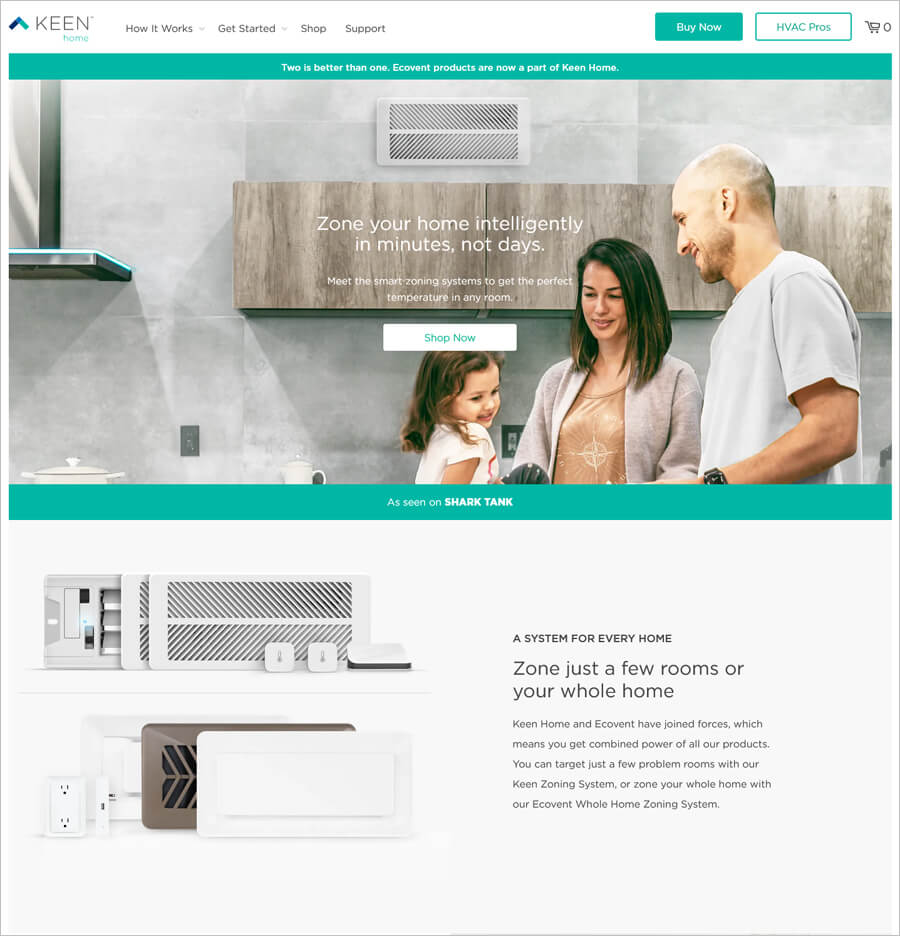
Keen Home offers proactive hardware and software products to let you live comfortably and efficiently at home. You can get a balanced home temperature system by clicking their website.
On the website, you will find large, professional-quality photos, beautiful typography, and page transition effects that add beauty to the look. You can easily navigate through the products through a navigation menu that is simple to use.
The Friday Habit Podcast
Made with Squarespace
Check this business website
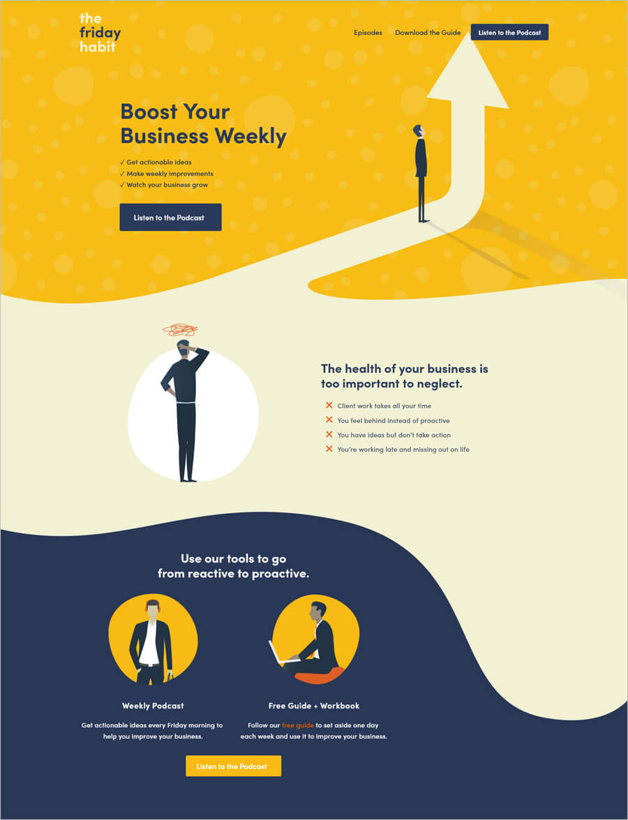
If you want to improve your business, you must listen to their Podcasts. They help entrepreneurs to build the business that works for them.
The Friday Habit Podcast uses a perfect design for the website with minimal visual elements and photos and images. The simple design strategy helps to keep the user focused on the related podcasts.
Wisteria
Made with WordPress
Check this business website
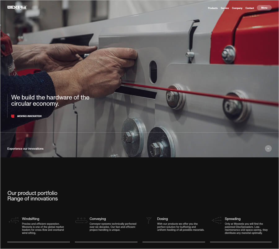
Wisteria is one of the global market leaders in recycling facilities. Its product portfolio consists of wind sifting, conveying, dosing, and spreading.
The Homepage takes a bit of an unusual approach. You will see a full-screen background image along with a brief statement about what Westeria does. As you scroll down, you’ll see several images with headlines so you can navigate to different site sections.
CPC London
Made with Strikingly
Check this business website
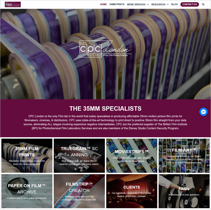
CPC London is a market leader in producing affordable 35mm motion picture film prints for projection.
You can see how beautifully it uses a video background on the Homepage and plenty of attention to detail throughout the site. The main navigation menu appears on the right side, which is very easy to find, and when you click on one of the main links in the menu, sub-navigation options appear.
Ception
Made with Wix
Check this business website
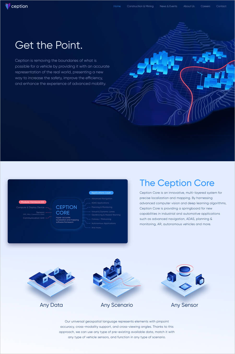
Caption offers an Artificial-Intelligence powered system to increase productivity, sustainability, and safety of industrial operations related to construction and mining.
The caption uses a dark blue background and lots of high-quality photos. The site also includes images of ongoing projects as you scroll and interact. Links in the navigation menu lead to major sections of the site so you can move around with ease.
Knapsack Creative
Made with Squarespace
Check this business website
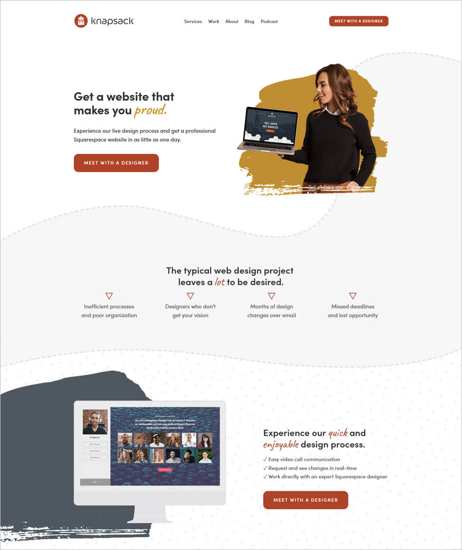
Knapsack Creative is a small creative agency that builds websites by capturing the client’s vision and goals through a simple, collaborative process. You will get clean, dynamic, and professional.
You will find a stand-out online with vibrant images on the Homepage that feels like an art exhibit. You will also love handwriting-style text when you scroll through the site, paired with a subtle background.
Taqnia International
Made with Jimdo
Check this business website
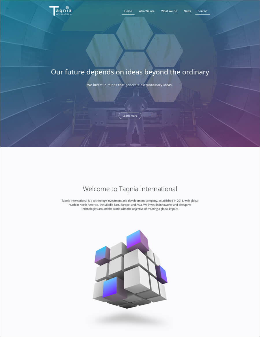
Taqnia International invests in R&D initiatives for portfolio companies with top research centers. Moreover, it offers technological services and equipment to innovative technology companies.
You will love the relatively simple design of their website. As you scroll down the page, you will notice many subtle animations to the images and effects that add a nice touch. Navigation has been thought about too, with social media icons in the end.
Zubak Group
Made with WordPress
Check this business website
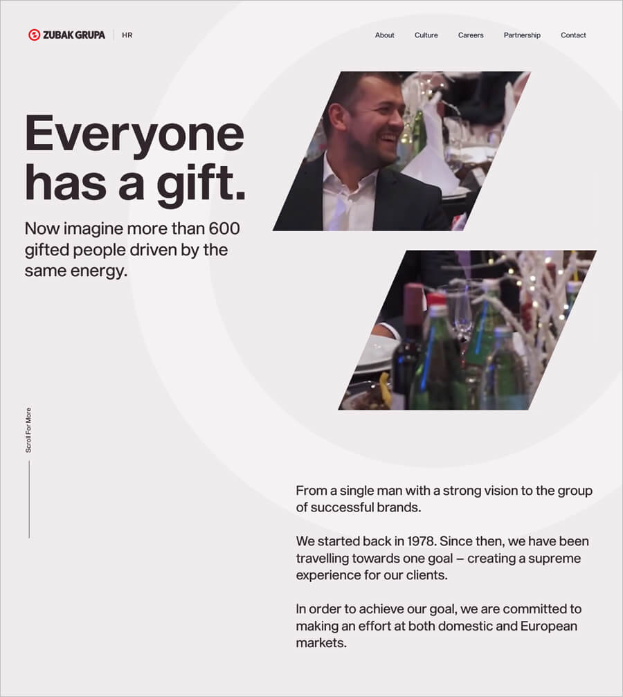
Zubak Group offers services for the sale and maintenance of new and used vehicles. They provide high-quality car repair services, selling of new and used cars, car rental, insurance, and inspection, road and home assistance, medical services, and much more.
You can see their online presence on the website with an efficient user experience. You will find a great example of a small business website that has efficiently used a combination of web development and design process. Using a video reel with subtle white background is a guarantee to impress other businesses.
Puffin Packaging
Made with WIX
Check this business website
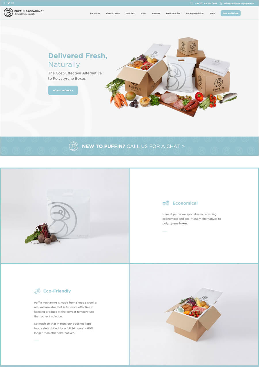
Puffin Packaging offers wool insulated packaging for food.
You will see an eye-catching and perfectly color-coordinated website. There are some cool responsive features as you move down the Homepage, like animated text and moving icons. All of the images used on the site go perfectly with the background and typography colors, making for a remarkable user experience.
Infloexa
Made with Weebly
Check this business website
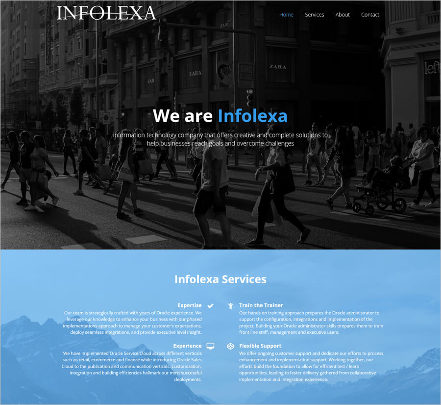
Infolexa is a software company that provides customized oracle service cloud and application integrations for organizations.
The design of the site is very subtle and clutter-free, incorporates just one image with less illustrations. It makes use of white background to add a strong visual element to the site and a handful of highlight colors.
SpokenLayer
Made with Squarespace
Check this business website
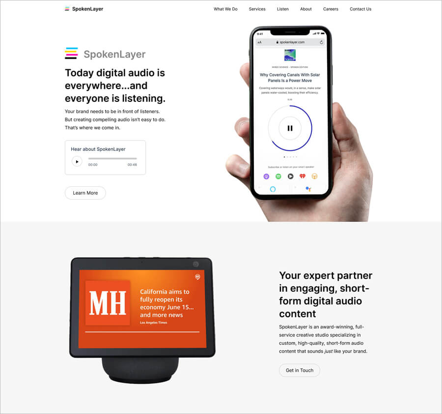
SpokenLayer is a digital audio creative studio, specializing in custom, high-quality, and short-form content.
The exceptional design that includes big, bold typography and some subtle effects is eye-catching. The site includes plenty of written content aimed at its target audience. Of course, you’ll also find all the necessary details about the services they offer and how they can help.
CUBEevo
Made with Webflow
Check this business website
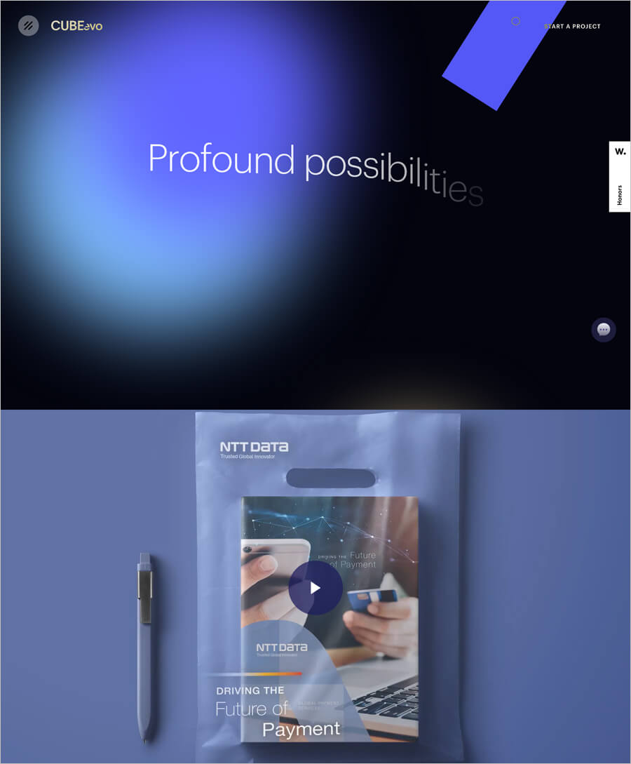
CUBEevo is a creative digital agency with solely focus on helping businesses explore and evolve forward thinking ideas into newfound possibilities.
If you click their website, the experience is enhanced with some unique transitions with dark blue theme. It gives a subtle and a positive user experience. This may also help to keep visitors on the site for longer periods of time. You’ll also see some subtle effects and videos when scrolling the Homepage.
Japan Mobility
Made with Duda
Check this business website
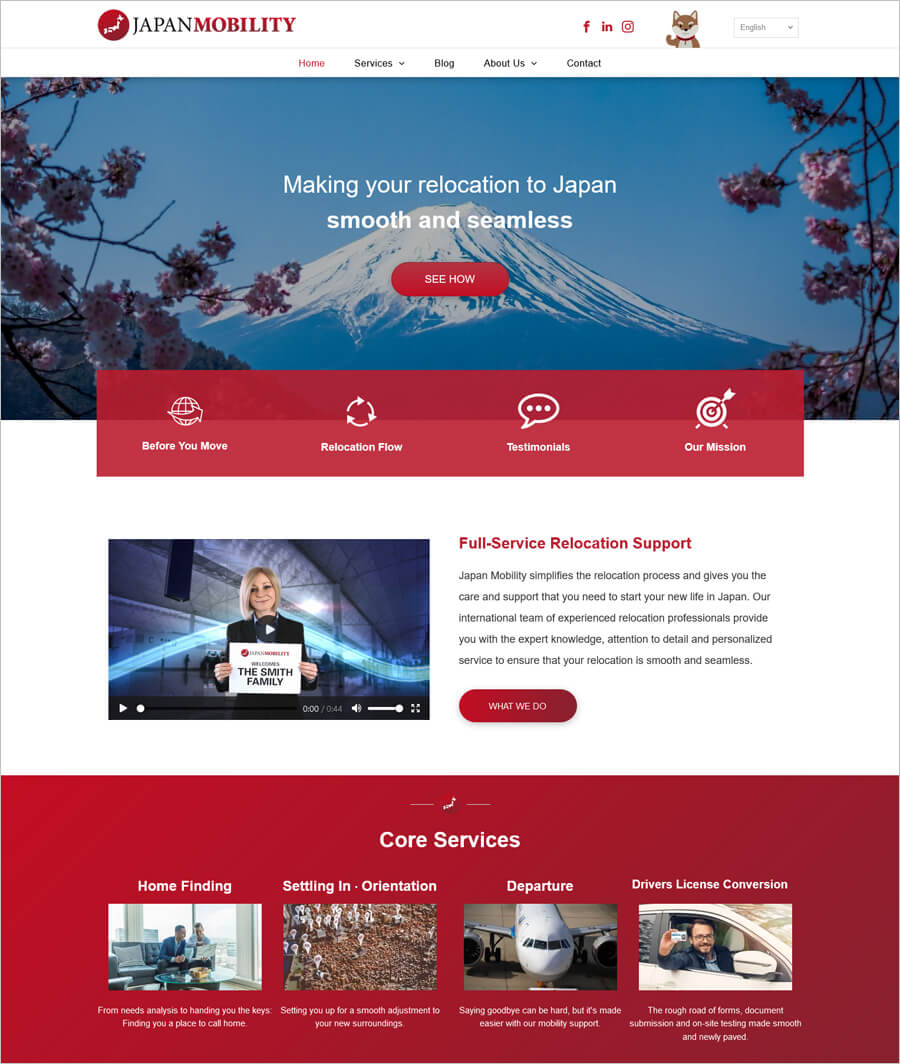
Japan Mobility simplifies the relocation process and gives you the care and support that you need from the day you arrive in Japan.
Website consists of subtle red and white theme with transition background patterns throughout the site. They provide some excellent visual effects without being overwhelming or dominating the design. And professional images complete the outstanding look.
Republic Capital Group
Made with Jimdo
Check this business website
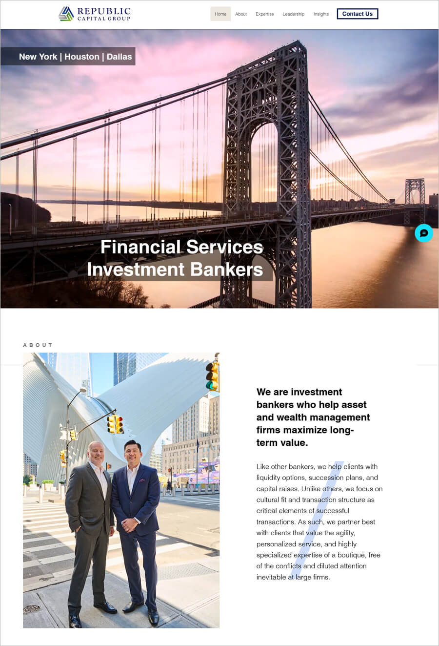
Republic Capital Group offers wealth management services and financial advisory to the RIA, asset and wealth management communities.
The website uses a simple overlay design, with high quality photos. As you scroll down the page or navigate the site, you’ll notice many subtle animations and effects that add a nice touch. Finding information is very easy thanks to a logical structure and a clear navigation menu.
Kuna
Made with Shopify
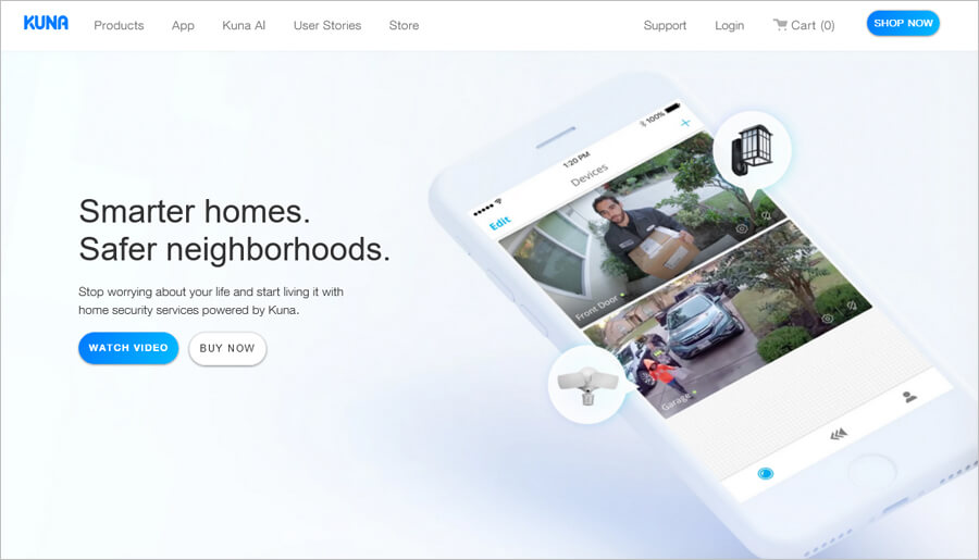
Check this business website
Kuna smart home provides security system to help you prevent break-ins and protect what matters to you most, from anywhere in the world.
There’s nothing confusing about the website layout. A sophisticated palette with beautiful images overlaid by beautiful text, the website directs potential customers to the brand’s main services from the landing page.
Infinity Works
Made with WordPress
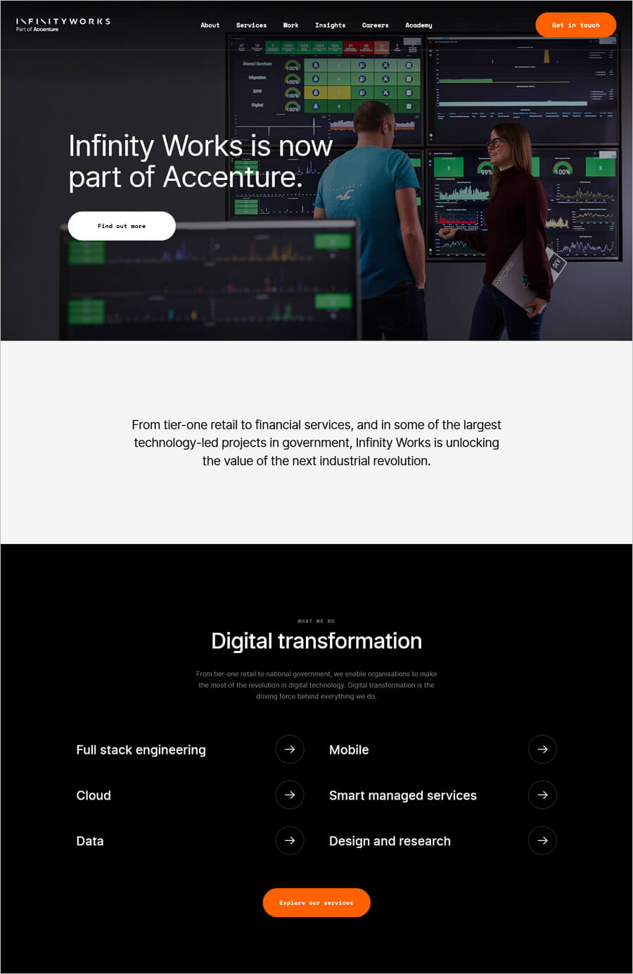
Check this business website
Infinity Works is a platform that provides digital cloud based transformation consultancy services.
Service website seems boring, right? That’s not always true, and this website can prove it. Take a look at the dramatic full-page photos that fill the Homepage. This business website makes use of bright white text, minimalist navigation, and a library of high contrast landscape images. The result is serious yet sleek.
Prometheus Group
Made with Webflow
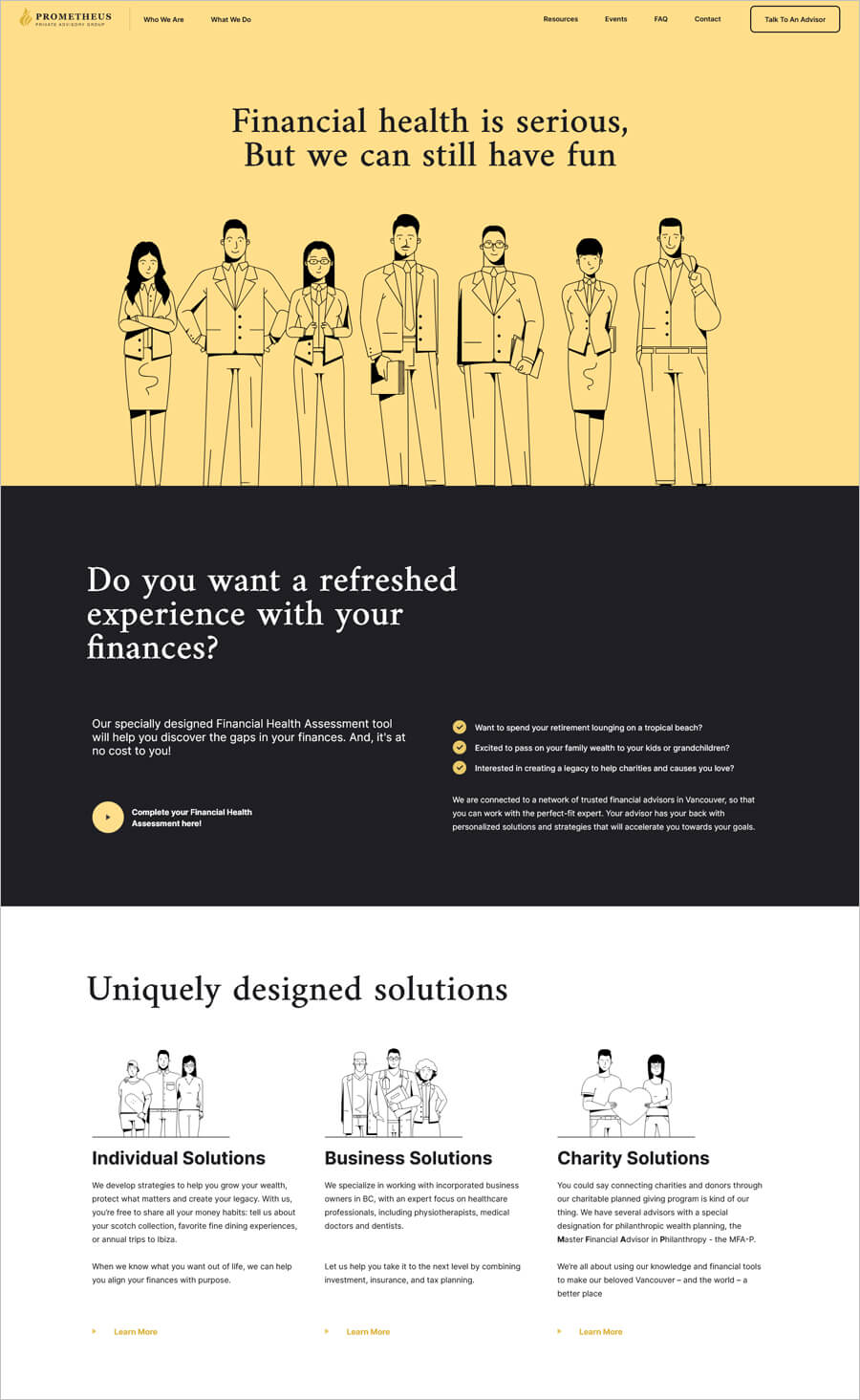
Check this business website
Prometheus Group is a financial advisory agency that offers financial planning and investment strategies for individuals, corporate or charity.
The Homepage takes a bit of an unusual approach by adding clipart and illustrations. Above the page, you’ll see a full-screen clipart images along with a brief statement about what PPA does. As you scroll down, you’ll see a number of images with headlines that link to different sections of the site.
Skipio
Made with Duda
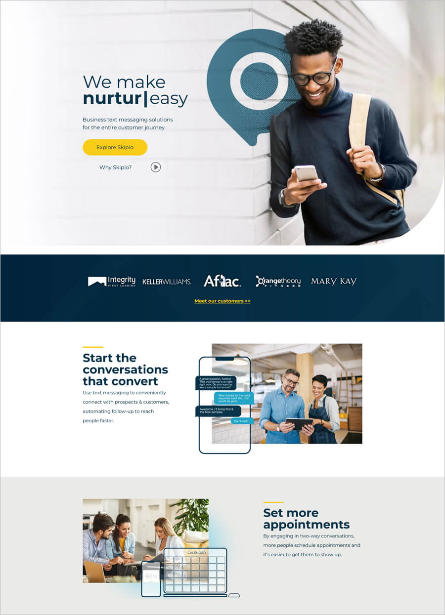
Check this business website
Skipio offers automated messaging tools, so you can start two-way conversations, build personal relationships, and enjoy lasting, repeatable success with sales and retention.
The site is very clean and clutter-free. It makes use of blue and white color to add a strong visual element to the site. Photos with different background color are used, and all of the colors work together to create a really nice visual.
Islango
Made with Wix
Check this business website
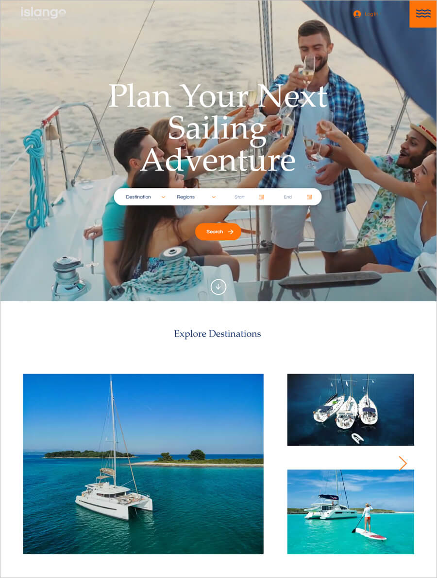
Islango is an online yachts and cruise booking platform that allows visitors to book for sailing vacations around the globe.
The website of this sailing service provider uses a full-screen video background on the Homepage and plenty of attention to detail throughout the site. The navigation menu opens up as you click on the hamburger icon to the left side of the screen.
ARCH Motorcycle
Made with Squarespace
Check this business website
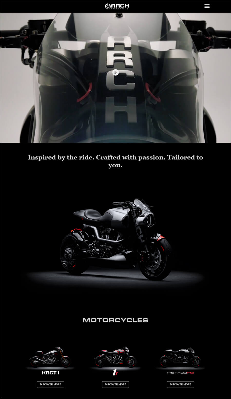
ARCH Motorcycle offers creative and innovative American motorcycles with a unique blend of performance, customization, and attention to detail.
The most colourful effects are showcased on the Homepage, uses a full-screen video background. You will see more colours and some subtle illustrations as you scroll down. Both the header and footer include links to the primary pages.
Helideck Certification Agency
Made with WordPress

Check this business website
Helidecks is a service provider of offshore fixed and mobile helicopters for the safe and compliant operations.
You will find a dark blue background features real life photos of past and ongoing projects. The site is also equally functional and helpful. The high-quality photos add a drastic visual appeal for you.
Hingham Auto Repair
Made with Weebly
Check this business website
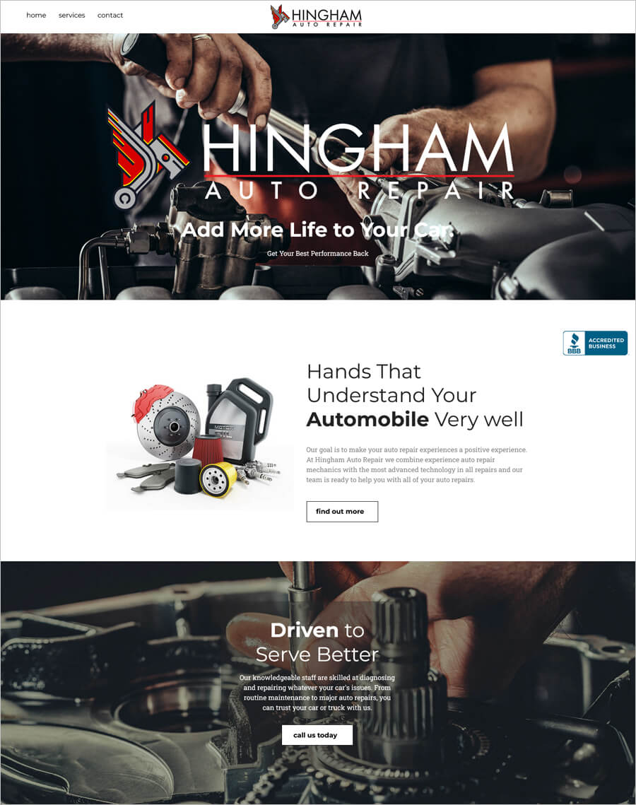
If you are planning to add life to your car then please visit Hingham Auto repair site. You will find a high class auto service in this garage. Hingham caters to all services from brakes to oil change to routine vehicle inspections.
Their website includes information on the various services. The layout is fairly simple and clean, and by scrolling down, you can access all of the content on the site.
Mangomolo
Made with Wix
Check this business website
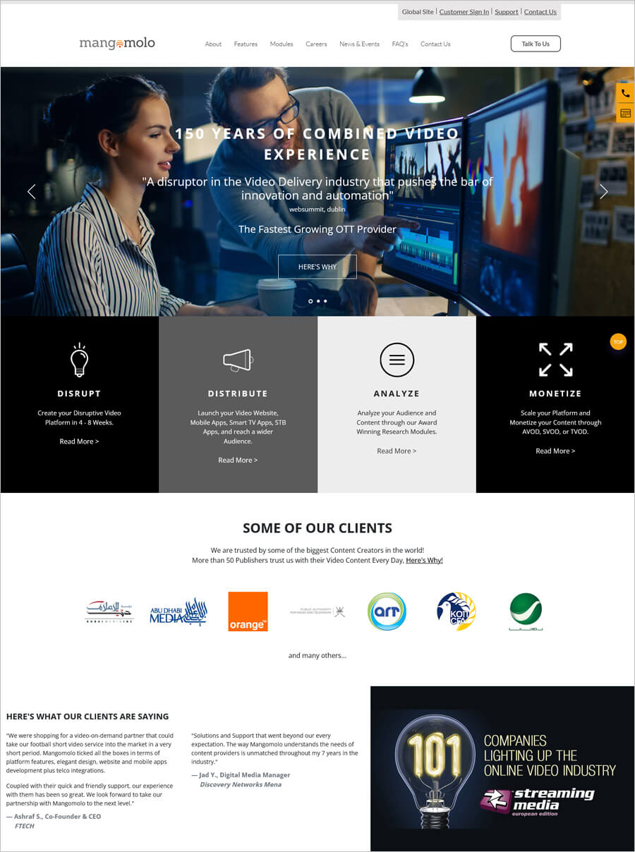
Mangomolo is the leading streaming/VOD provider in the MENA region, offering an innovative turnkey solution catering to all media outlets.
Website of Mangomolo uses a clean and minimalist design and showing team members on the Homepage. As you scroll down, large images and clients will appear. Company information is readily available and a nice touch is the use of subtle colour hues throughout the site.
Brave the Skies
Made with Shopify
Check this business website
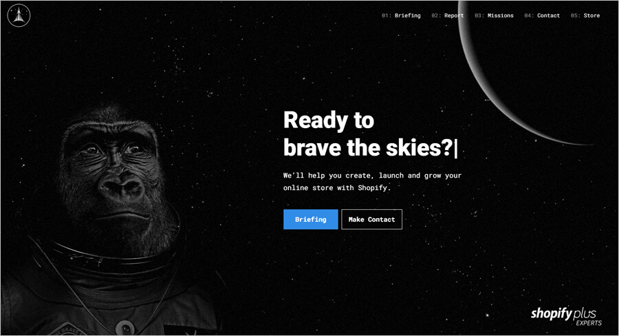
Brave the skies provide you a platform to help you create, launch and grow your online store with Shopify.
The use of a chimpanzee on the Homepage gives an image to the visitor what Brave the Skies does and what can it do to your ecommerce business. A clean design, while presenting all of the content you would expect from the website is a true example of small business website
Alive 5
Made with Duda
Check this business website
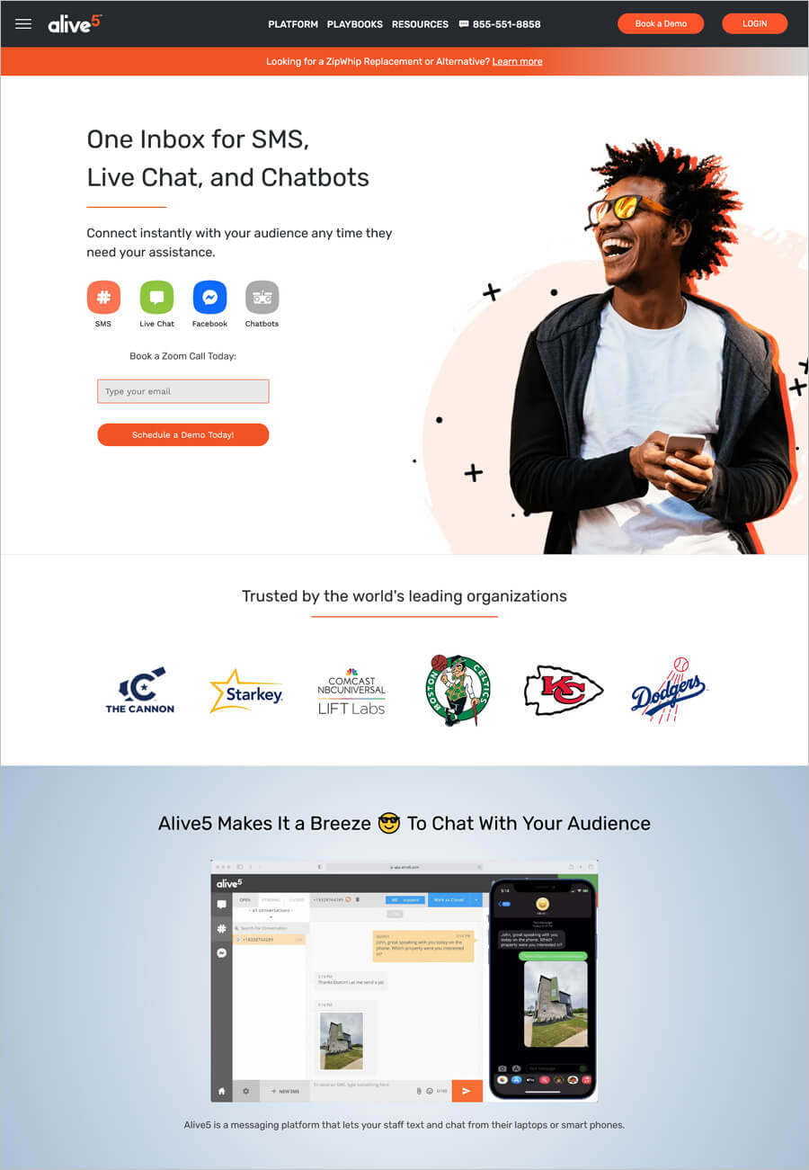
Alive5 is your one inbox for live chat, send a text message, or connect via Facebook. Alive5 lets you engage with your audience with integrated CRM.
You are going to love the big, cliparts and lots of scrolling effects on their website. The navigation menu jumps to specific pages, or you can just scroll down.
No comments yet